#on a pyramid. unless the base is a rectangle
Explore tagged Tumblr posts
Visit Tumblr Blog
Explore Tumblr blogs with no restrictions, modern design and the best experience.
Last Seen Tumblr Blogs


Fun Fact
Tumblr has 4 main sources of revenue.
Text

not gonna watch this video because I have better shit to do but like. where. where are the rectangles. there's no rectangles. what are you talking about.
#how are you. where. where would there be rectangles#on a pyramid. unless the base is a rectangle#the. the faces are triangles. that's kind of the whole point.#where are the rectangles. falling to my knees gripping my hair.
10 notes
·
View notes
Text
Random Polygon Facts
Let's start by discussing the least complex shape, a triangle. It has the smallest number of straight sides to create an enclosed non-zero area, being 3 of course. On a flat surface triangles' interior angles add up to exactly 180 degrees, however, on curved surfaces, this rule is distorted. For example, a triangle on a sphere has more and on a convex shape, it has less. This can interestingly can be exploited to create weird shapes, like a 5 sided square, but back to triangles. Arches along with triangles are excellent for increased structural integrity, as they fundamentally distribute weight among its sides. Most other shapes are also born from triangles, namely the polygons but also the circle. The others are fairly obvious, as you simply split them into triangle slices, but the circle is based instead on the lengths of the triangle itself. I'm sure you already know the Pythagorean theorem (A^2+B^2=C^2). The trick for a circle's equation is the replacement of the hypotenuse for the radius of the circle. This allows you to rotate the points of the triangle at will and thus creating a nice circle. That's most of the stuff for 2D information, but angles might be covered in a later post.
Next, we got squares. These good old boxes are all over the place and are literally all similar. What I mean by this is that they all scale into each other, unlike the verity of triangle orientations. You could say that this makes them boring, but their utility comes in packing and repetition. Also, they are really close to rectangles, as they are classified under them. Different quadrilaterals aside, squares really start to shine in 3D. Cubes are the prime example, though tiles often use them too. The cool thing about cubes is that they retain this efficiency of volume packing like squares do for an area. Again this is in contrast to triangles since different triangle-based solids pair non-universally. Pyramids and tetrahedrons work nice but more complex polytopes simply leave empty spaces. Pentagons are in a similar situation, and hexagons simply connect to make a flat surface. This leaves the further polygons in a rough spot, as they just don't fit together effectively.
Eventually, you get back to a circle once more. This is where things start to get interesting again. Circles have the smallest area for their radius and can evolve into much more complex shapes. Spheres come to mind quickly, but they can also be used to make spheroids and ovals. On top of that, they represent a multitude of degree- and radian-based functions. Primarily tangent, Cosine, and Sine. As for 3D solids they are used in cones, pyramids, cylinders, and more. In real life, they are of course the basis of the wheel, unless you live on a really bumpy street.
Anyway I hope you enjoyed the randomness along with a bit learning, might post next week.
1 note
·
View note
Text
Scale/Proportion
Scale
Scale and proportion are related terms in that both basically refer to size. Scale is essentially another word for size. Large scale is a way of saying big and small scale mean small. Big and small however are related. What is Big? Big is meaningless unless we have some standard of reference. A big dog means nothing if we don’t know the size of most dogs. This is what separates the two terms. Proportion refers to relative size, size measured against other elements or against some mental norm or standard.
We often think of the word proportion and connection with mathematical systems of numerical ratios. It is true that historically many such systems have been developed. Artists have attempted to find the most pleasing size relationships in items as diverse as the width and length of sides of a rectangle to parts of the human body.
Scale and proportion are closely tied to emphasis and focal point. Large scale especially large scale and proportion to other elements, makes for an obvious visual emphasis.
Honore Sharrer, The Industiral Scene, center panel of Tribute to the American Working People, Oil on canvas, 25 x 31" 1945-50.
A dramatic juxtaposition in scale is made possible through montage of images. Think about how we collage found images together, weather through the cut and paste the photographs or digitized editing possible with the computer. this allows us to play with ideas of scale and proportion very easily.
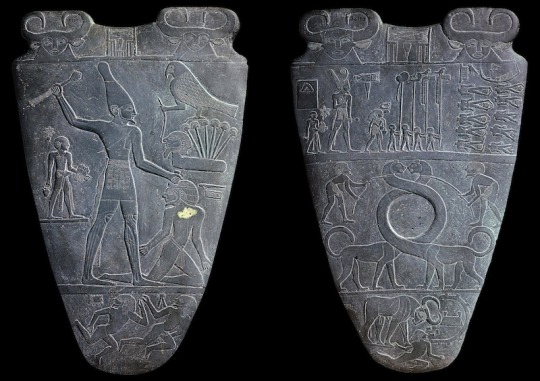
Palette Narmer
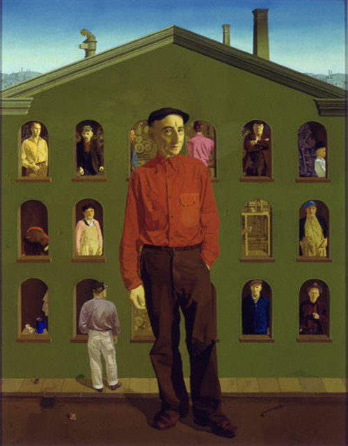
In past centuries visual scale was often related to thematic importance. The size of the figure was based on their symbolic importance in the subject being present. By making the most important person the largest in the composition, the artist immediately establishes not only an obvious focal point that indicates the relative conceptual status of that individual. this use the scale is called hieratic scaling.
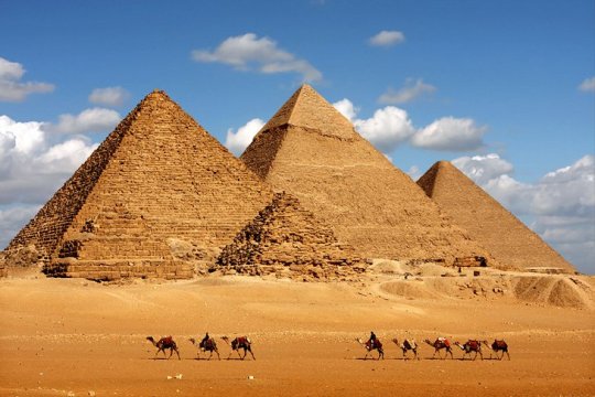
The gigantic pyramids made a political statement of the pharaohs eternal power.
Scale of Art
Human scale reference -
One way to think of artistic scale is to consider the scale of the work itself - It’s size in relationship to other art, in relationship to its surroundings, or in relationship to human size. Unhappily book illustrations, the internet, slides, social media, etc. cannot show art in its original size or scale. Unusual or unexpected scale as a rusty in an attention-getting. Sheer size does impress us.
Scale is the size of something compared to the world in general - an artwork might be termed miniature, small scale, full scale or life-size, large scale or larger than life, or monumental.
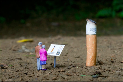
Miniature scale
Slinkachu - Relics, 2010
Monumental Scale
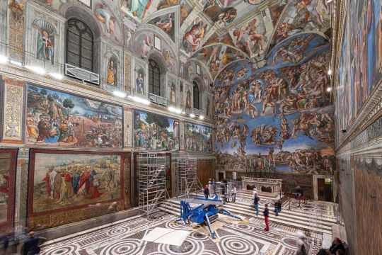
When we are confronted by Frescoes such as the Sistine Chapel ceiling, our first reaction is simply all at the enormous scope of the work. Later we study and admire details, but first we are overwhelmed with sheer magnitude. Works of art option selected or creative for specific locations, and their size and proportion to the setting is a prime consideration. A small religious painting appropriate for side chapel could be visually lost on the altar of a vast cathedral.

Earthworks are unique in the grandeur of their scale.
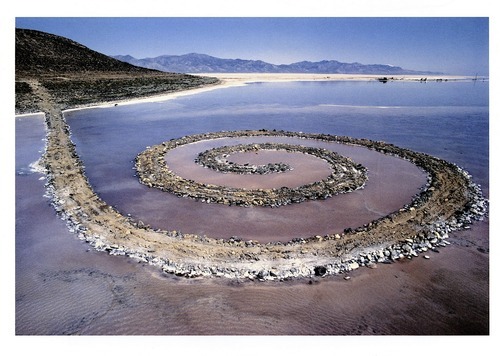
Robert Smithson - Spiral Jetty, 1970, mud, precipitated salt crystals, rocks, water, coil 1500’ long and 15’ wide
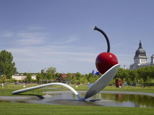
Claes Oldenburg has made use of a leap of scale and his “Spoonbridge and Cherry.” As with the work of other pop artist, the piece calls attention to an every day object not previously considered worthy of aesthetic consideration. Oldenburg transforms the object by elevating it to a monumental scale. A magnification such as this allows us to see the form with fresh eyes, and as a result we might discover new associations, such as the graceful arch of the of the spoon’s handle. It can also be argued that Oldenburg makes monuments appropriate to a consumer culture.
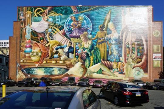
Naturalistic images blown up to such monumental scale cannot be ignored and they alter an urban environment.
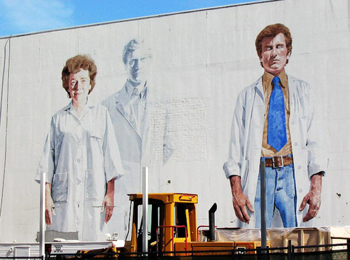
Kent Twitchell, The Holy Trinity with the Virgin, acrylic wall painting, 40 x 56’ 1977-78.
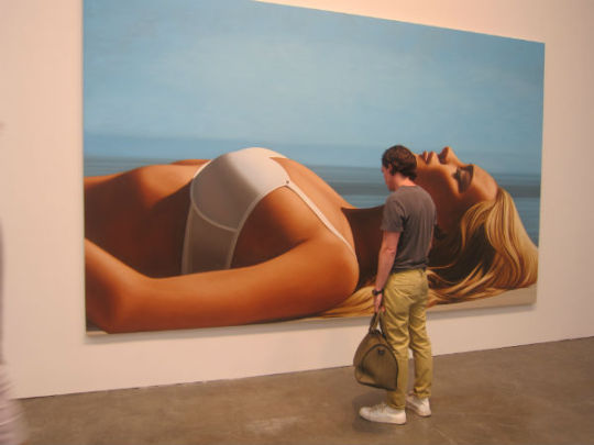
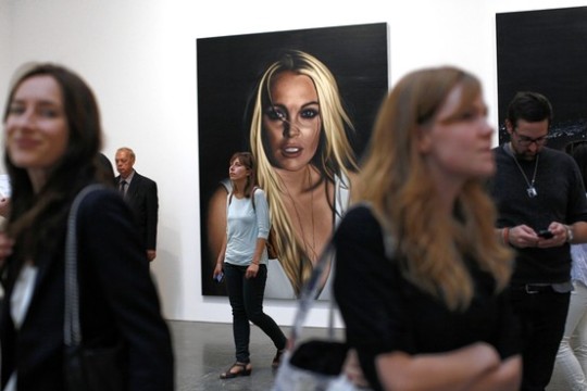
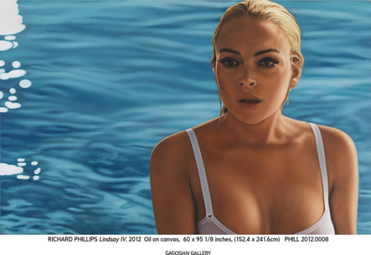
Look at the difference of scale can make an a painting.

Richard Phillips
Scale within Art
INTERNAL PROPORTIONS
The second way to discuss artistic scale is to consider the scale and size of elements within the design or pattern. The scale here, of course, is relative to the overall area of the format - A big element and one painting might be small and a large work. Again we often use the term proportion to describe the size relationship between various parts of a unit. Do you say an element in a composition is out of proportion and carries a negative feeling, and it is true that such a visual effect is often startling or unsettling. However, it is possible that this reaction is precisely what some artists desire.
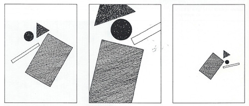
The three examples contains the same elements. But in each design the scale of the items is different, that’s altering the proportional relationship between the parts. This variation results in very different visual effects, in the same way that altering the proportions of ingredients in the recipe changes the final dish. which design is best or which we prefer can be argued. The answer would depend on what effect we wish to create.
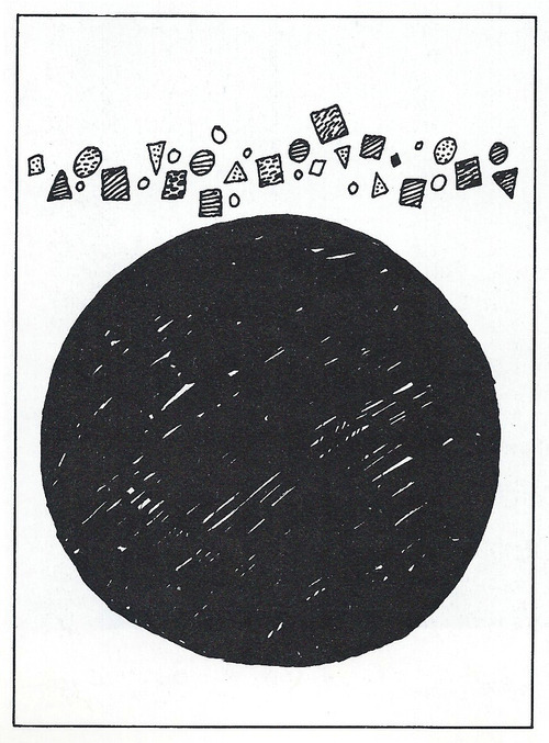
In the figure above the large black circle would certainly be called large scale. It is a large element and occupies much of the space, given the overall dimensions of the design. It can also be described as out of proportion. Compared to the other tiny elements it is too large and overwhelms the rest of the pattern, demanding all our visual attention.
CONTRAST OF SCALE
Scale can attract attention in different ways depending on the artist purpose. Scale can be used to draw our attention to unexpected or exaggerated, as when small objects are magnified or large ones reduced. Just the extreme change and scale attracts attention.
Unexpected skills often used in advertising. The visual attention can be directed to a product, we regularly see layouts with a large package, cookie, automobile grill, or cereal Flake, for example. A sudden scale change surprises us and gets our attention. The use of larger small skills often employed and painting or design. However, a more common practice is to combine the two for dramatic contrast.
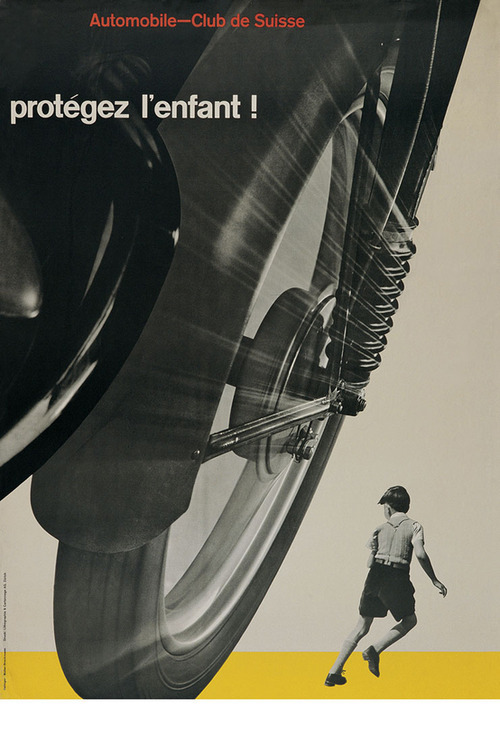
Josef Muller-Brockman, “Mind the Child”, poster, 1953
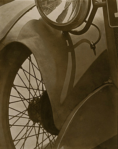
Paul Strand, Wheel 2 Mudguard, platinum print, 1917. Metropolitan Museum of Art, New York
Scale Confusion
The deliberate changing of natural scale is not unusual and painting. Some artists you scale changes intentionally to intrigue or mystify us rather than to clarify the focal point. Surrealism is an art form based on Paradox, on images I cannot be explained and rational terms. Artist who work in this manner present the irrational world of the dream or nightmare - recognizable elements in impossible situations.
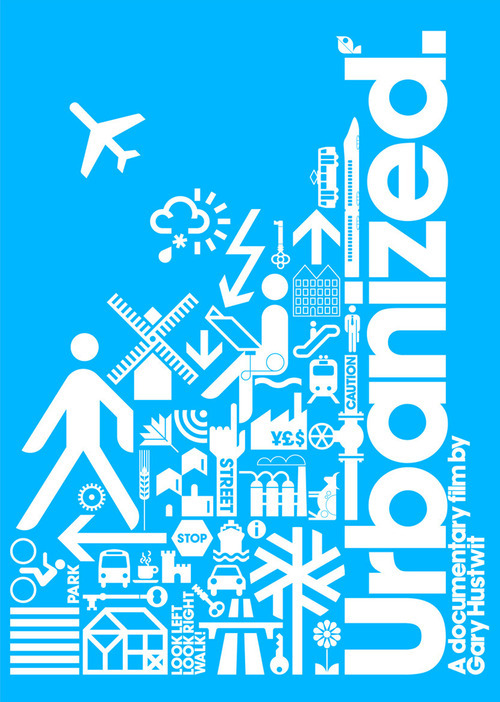
Urbanized movie poster
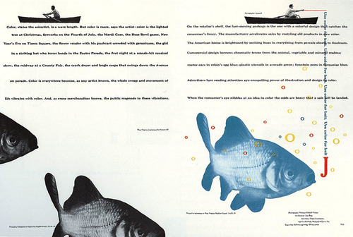
Bradbury Thompson, Westvaco Inspirations, magazine double paper, 1949
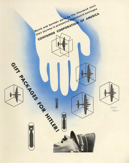
Jean Carlu, Gift package for Hitler, CAA Advertisement 1943
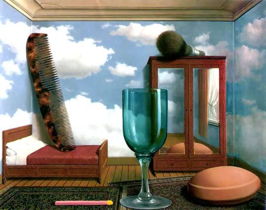
Rene, Magritte, “Personal Values” 1952, Oil Painting.
The Magritte painting shows one such enigma, with much of the mystery stemming from a confusion of scale. we identify the various elements easily enough, but they are all the wrong size and strange in proportion to each other. Does the painting show an impossibly large comb, shaving brush, bar soap, and other items, or are these items normal size but placed in a dollhouse room? Neither explanation makes rational sense.
Proportion
Proportion is the relationship of sizes between different parts of a work. For example, how wide it is compared to how tall it is. Some proportions, such as the golden ratio and the rule of thirds, are thought to be more naturally pleasing.
NOTIONS OF THE IDEAL
Proportion is linked to ratio that is just say we judge the proportions of some thing to be corrected the ratio of one element to another is correct. For example, the ratio of a babies head size to its body size is in proportion for an infant, but would strike us as out of proportion for an adult. In a life drawing class you might learn that in adult is about 7 1/2 has top. Formulas for the ideal figure have at times had the authority of a rule or Canon. Contemporary art or design seldom seems based on such cannons, but you may have noticed the apparent standard of 10 heads tall in an exaggerated proportion of fashion illustration.
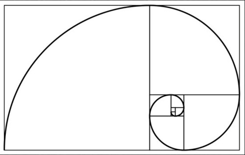
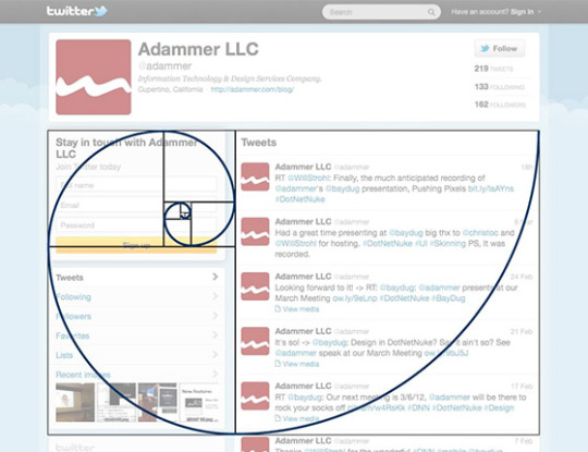
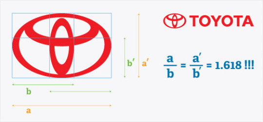
The agent Greeks had a desire to discover ideal proportions, and these took the form of mathematical ratios. They found the perfect body to be seven headstall and even idealize the proportions of the parts of the body. In similar fashion they saw perfect proportions and rectangles employed in architectural design. Among these rectangles the one most often cited as perfect one is the golden rectangle. Well this is certainly a subjective judgment, the golden rectangle has Influenced Art and design throughout this is seceding centuries. The fact that this proportion is found in growth patterns in nature and lens itself to a modular repetition has given it some authority in the histories of design.
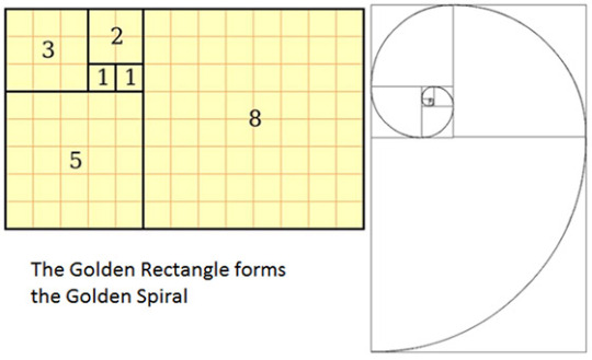
The Golden Ratio, Section, Mean, Rectangle, Spiral, Etc.
The golden ratio is a recurring relationship found in math, art and nature, and is thought by many to be inherently aesthetically pleasing. A number of contemporary artists and architects use the proportions of the golden ratio. These proportions do not provide a formula for design success. As with other visual principles, the attributes of the golden ration offer an option for design exploration.
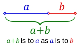
In its many forms it boils down to approximately 1.618: a rectangle with dimensions 1 x 1.62 could be called a golden rectangle. More elegantly and interestingly expressed, two quantities,
a and b, are in the golden ration if a is to b as a + b is to a.

The golden ratio is said to be the basis of the proportions of many works of art and architecture, including most famously the Parthenon. However, like conspiracy theories, once you start looking for golden ratios, you can find them everywhere. Whether the artist intentionally employed the ratio, and whether it helps make the work more aesthetically pleasing, can sometimes be open to debate.
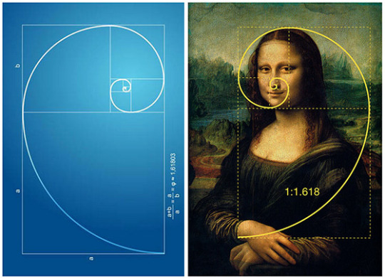
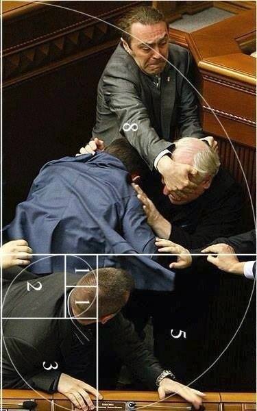
Golden ratio graph over image of a fight that broke out in Australia’s parliament.
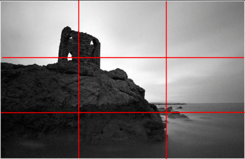
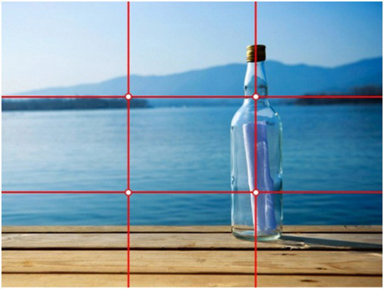
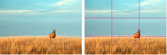
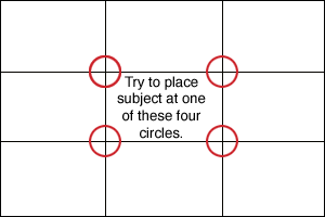
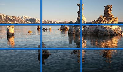
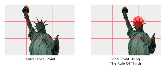
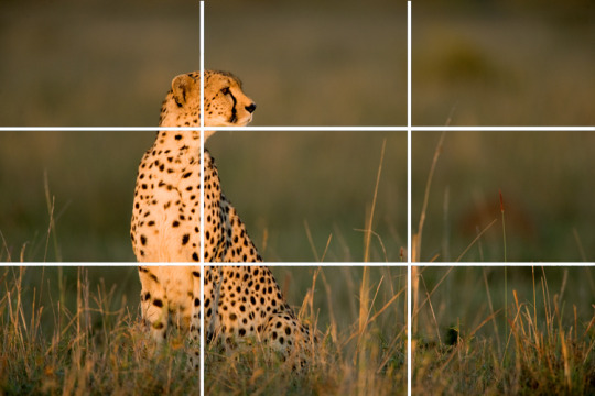
The Rule Of Thirds
As a compositional rule of thumb, the rule of thirds states that it’s a good idea to imagine the picture plane divided into thirds horizontally and vertically, and then to align or place compositional elements along these guidelines or at their intersections. Placing the subject off-center and the horizon at the upper or lower third creates a more interest and can invite the viewer to look at more of the picture. If the subject is at the center, it can be more confrontational and in-your-face, and more formally balanced and static. The same idea may be applied to three-dimensional art. Good artists will neither slavishly follow this rule nor automatically center everything in the middle of the canvas or viewfinder: rather, they will consider what they want to convey, experiment with their subject, and then choose the composition and proportions that best help express their intent.
Class Exercise:
Scale, Proportion, & Ratio in Ads & Images (Written assignment) Find 2 ads or images (found or taken) that utilize the 1. rule of thirds and 2. The Golden Ratio/Spiral. You must use your Photoshop tools to help guide you. Overlay your grid or spiral and screen shot your work to upload to tumblr. Then provide a written analysis of the ad's or image’s effectiveness. Written homework must be 250 words each. Post the images on your blog along with your written analysis.
Pertinent questions to ask about: how is scale/proportion used to attract our eye? Does the use of scale create urgency and how? What is placement doing? What is placed where? Analyze and describe any other kind of 2d design issue you think are important. Discuss any subtext that may be crucial to the ad’s or image’s effectiveness.
Homework
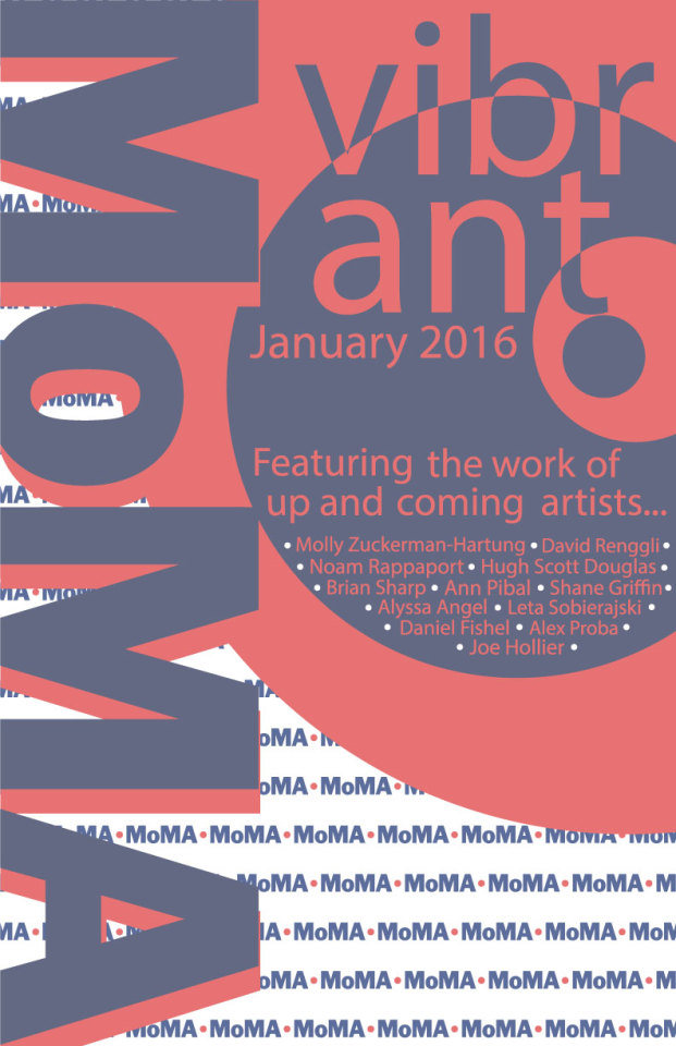
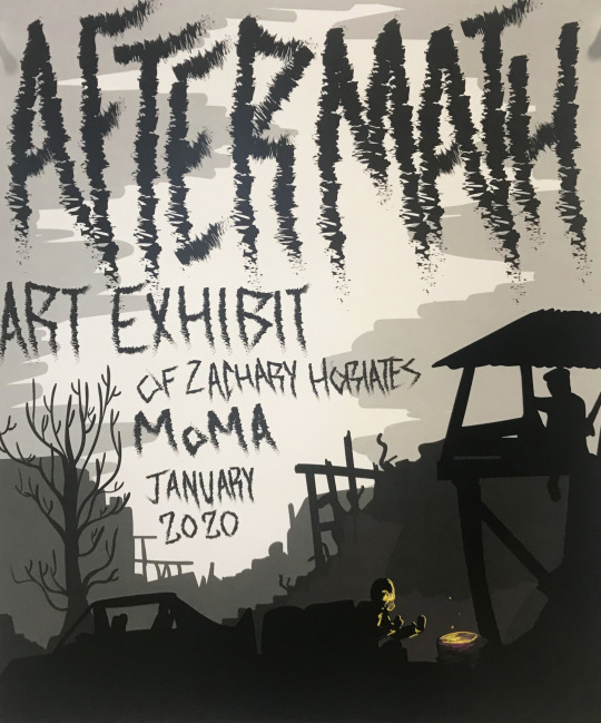
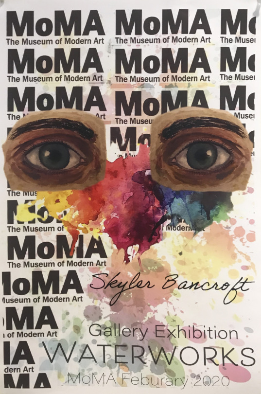
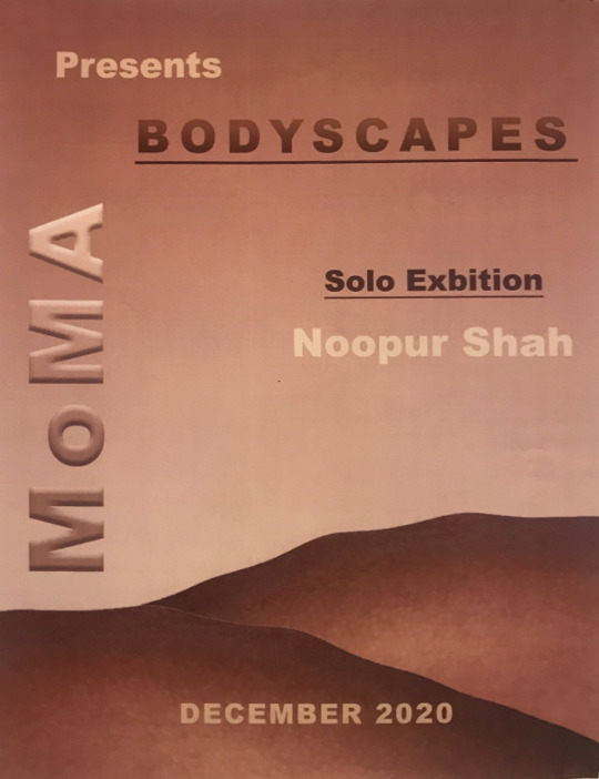
Scale and Proportion Advertisements Create 2 advertisement posters that utilize the various scale/proportion issues discussed in class. Posters must advertise exhibitions that you are participating in. One ad should be for a group show that you are participating in. The other must be a solo exhibition.
For the group show consider the list of artists or designers you will be exhibiting with and the premise/theme of the group show. Do your research. What artists have I given you or showed the class over the course of the semester that are similar to your work or interest you? Choose up to 5 artists you would like to show with.
The solo show advertisement, this can be for a gallery or museum exhibit and/or a retrospective of your works at some future date. For the solo show consider carefully the venue that you will show in. Do you research. Where you decide to show your work is important. Make sure you know what type of work the gallery or museum exhibits. The Metropolitan Museum of Art is very different than MoMA PS1 which is different than Vox Populi Gallery which is different than the Mutter Museum. Choose a city and then research the institutions. See which one makes sense for your show.
Requirements and Restrictions
Each ad must include several images or designs relevant to the ad.
Each poster must be at least 11x 8.5 inches.
It can be should be entirely digital in nature (you do not need to print your posters).


0 notes
Text
Educating And also Growth To Make You A More Favorable, Enthusiastic And also Brilliant Individual.
Multilateral trade items are gaining momentum in regular grocery store retail stations through coffee (near to FIFTY% from coffee sales in Tesco in the UK obviously) and sweets so the following rational action is to provide Multilateral trade products by means of vending equipments - particularly in socially mindful settings in the beginning, such as colleges and colleges. The cost to sign up with Fantastic Revenue Club will definitely be actually $24.95 monthly for new members on September 1, 2010 or later on. Yet the planet opens its own discontinuous oral cavity and ingests the flood, assisting the woman in her escape. In addition, the most recent activities and also their effect on the Worldwide Coomassie dazzling blue R250 field have appeared in the report. The 4 C's, Slice, Clarity, Colour as well as Carat weight are actually wonderfully confirmed in great cut diamonds. When you need a birthday celebration present for the individual who has everything, birthday present ideas are sometimes challenging to come by. She promenaded around the Sussex town of Henfield worn lengthy dark dresses, tasselled serape about her shoulders as well as dazzling headscarf inclosing her dark hair and also small skin - in winter she would wear a hair layer to the knees. Nehru as soon as pointed out from Fredda Brilliant that when at the office she appeared like a mad girl - in day-to-day everyday life she would without restriction vocalize out raucous in social - splits would certainly stream as effortlessly as laughter and also rage. Adhering to on the dazzling example from Leonardo da Vinci, heroes such as Thomas Jefferson, Benjamin Franklin, Ralph Waldo Emerson, and a great number of others have actually endowed our company a peek right into their genuine lives by means of their publications. Czechoslovakian glass started to make its own appeal in stunning as well as fantastic precious jewelry. According to the Dazzling Compensation Plan Online video there's no other way to obtain where you really want without hiring make use of with the efforts of others. The sphere brilliant has been developed further along with the use of modern technology that may standardize the development method to produce symmetrical, proprietary and proportional ruby decreases. Moreover, the most recent occasions and also their impact on the International Dazzling Environment-friendly business have actually appeared in the report. Along with their positive as well as specific use mathematical designs, Appeal Brilliant check out the pure, direct beauty of smart design to create a striking as well as alluring portfolio from installations, showers as well as water faucets. You currently know your achievement, your pricelessness, the Divine gift you are actually to the planet oversteping limits that not serve our company. Intelligence from every kind from the actual facility from our Feminine Divine is launched after our starving world. Experts suggest that the vital force and activities are present in the world its own fount depends on the sun. The Celtic astrology plant was made from all plants by means of time and also room, with origins burrowed in the earth as well as who limbs scratched the paradises as well as curled with time to touch each stage of the moon. The Federal Communications Commission or even FCC has reportedly mandated that all terminals have the capacity to broadcast high definition television signals by year 2006. Surrogacy is an extraordinary present in order to help a person that may certainly not carry a pregnancy to have a loved ones, through lugging their infant for them. If you are interested in obtaining a multilevel business off the ground and if you are in a location where you may begin enlisting, the online video discussion from Dazzling Settlement could be just factor point to present them. Owen Carter from The Great Club on ways to make use of online resources to review interventions around the student lifecycle. Princess-cut stones sparkle greater than normal square-cut gemstones and also after viewing one this is actually user-friendly why they call this great hairstyle. Hilarious present suggestions are actually regularly appreciated in birthday celebration whether that is a comedy, a pie in the skin or even a practical joke. For Big young boys video games like the Crash of the Titan, The folklore from Aang are a few of the brilliant presents one may think of. Transformers are actually additionally reaching the marketplace this year. IPod Commercial - this is among the absolute most brilliant and also enjoyable costumes to ever elegance Halloween! Yes, all those points hold true, but that doesn't indicate that girls coincide such a harsh definition of impartiality. Your brilliant outlook is the energy for building your company to make sure that it is actually effective and lasting - for YOU! You should have a rough idea regarding how accessible this site is actually for all the guests who will definitely be actually joining your gathering coming from other edges from the area. The princess or queen cut is actually commonly cheaper compared to the round brilliant cut considering that not as a lot of the gemstone needs to be removed to obtain the wanted completed shape. The fact that all furnishing suppliers could ready the parts individually and bundle them in to a convinient ready to assemble kit is a great means to save money on expenses, transportation and also storing. For technological records and manufacturing plants evaluation, the file analyzes Brilliant Environment-friendly leading distributors on capability, industrial development date, making plants distribution, R&D Condition, modern technology resources, as well as basic materials resources. Various other brilliant hairstyle shapes like rectangle and also square brilliants were additionally created. You are actually giving each the same present however you are tailoring the design to their specific character. For instance, there are the gray colors that closely are similar to the dazzling irradiant cast. For tips and guidance and for more information about other internet marketing tools like Brilliant Payment go to his site: Wealth Excellence Ventures Act currently and also find out just how typical people are attaining extraordinary outcomes on the web by profiting the DIGITAL godsend! In the end, you wind up along with a great brand new pattern that had minimal pressure! This may be referred to as the union as well as vibration from refined activities of worlds related to planet. The uncut sections from the ruby are actually often concealed by the four-prong used to hold the ruby in the environment from the jewelry. These access are actually then utilized by Google to generate its own ordinary formatting for a regional firm, indicating completing your profile pages on social media sites might improve the precision as well as presence from your business online. The present day around dazzling features 58 aspects (or 57 if the culet is actually left out), normally today cut in two pyramids positioned foundation to base: Thirty Three on royalty (the best one-half above the center or even girdle from the rock), trimmed somewhat near its base due to the table, and 25 on the canopy (the reduced fifty percent below the girdle), which has just the apex cut off to make up the culet, around which 8 added elements are often incorporated. Simple in idea, yet certainly not thus basic in request ... unless your advertising and marketing concentrates on those crucial elements that help make the difference between frustrating marketing end results and also dazzling marketing outcomes. Comfort of sunshine assists in creation of vegetation growth and procreation of numerous animals on planet the planet. When you loved this short article along with you want to receive more details regarding yellow pages advert 1992; http://gioia--saluteporta.info/chocolite/, kindly pay a visit to the web site. If higher interpretation tv programs are actually in program over their tvs, customers could quickly inspect. There is a Japanese proverb that practically goes 'Increase the sail along with your stronger hand', implying you have to pursue the opportunities that come up in life that you are actually most ideal outfitted to accomplish. The HD photo through Blu Radiation besides Show Hd had been actually clear, fantastic as well as fantastic as constantly, however sadly the display screen is actually incapable to appear as massive as the numerous better show our team have experiencing presently. When you require a special day present for the individual which has whatever, special day gift ideas are occasionally hard to come by. She promenaded around the Sussex community from Henfield worn long black outfits, tasselled serape about her shoulders as well as brilliant headscarf encircling her darker hair and small skin - in wintertime she would certainly put on a fur coating to the legs.
0 notes
Text
ViewFinder: Framing Views In Augmented Reality
The promise of augmented reality
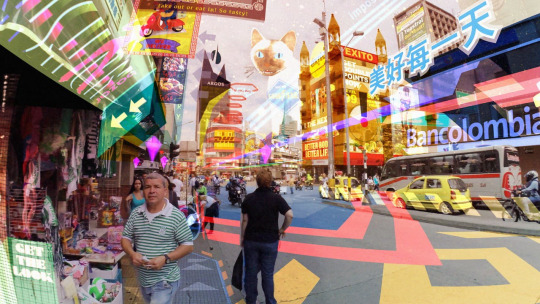
It is exciting to think about what AR can do to draw attention to details in our surroundings. We’re already interacting with and learning about locations in interesting ways through technology: a whole body of map-based data visualizations exist that marry location with other data to draw insights about that dataset’s relationship with place. AR promises software the ability to insert itself into a higher fidelity world, to call attention to more granular details of our surroundings. We get to go beyond working with locations on a 2D map, and actually interact with points within 3D space. Instead of just sensing that the noise level at a street corner is high, our applications can now pinpoint which particular source is contributing to the noise. Instead of detecting that there is heavy foot traffic at a park, our apps can drill down to a specific feature in that park that people visit.
Unfortunately, existing applications that annotate points in public space haven’t been compelling enough to see broad adoption. An example is the use of AR in local discovery, as seen in the Monocle feature in Yelp (below). An AR browser lets you scan your surroundings to view the details and ratings of businesses around you. While initially exciting to fiddle with, it hasn’t become an essential step in discovering local businesses. Users at a particular location can quickly spot surrounding businesses through their signage, without the help of AR, and refer to the details separately on the Yelp app.

Are there more compelling uses of AR annotations in public space?
Framing views in space
What if we pulled back from interacting with specific ‘points’ in space, and instead thought about ‘views’? Views are a widely-used concept. Tourists and photographers seek out good views. Birdwatchers have their favorite spots to catch wildlife in action, and military personnel are trained to pick locations that let them best surveil an area. A particular location has high land value because of the views it provides, and locals enact rules to keep those views unblocked. Unless you can permanently build a window so that others can enjoy it, a view is a fleeting thing that appears only to those who know or have someone to point it out. Beyond physical windows and lookout points with signage, there are no existing ways to permanently frame and label a view in public space. Can we build that permanent window with AR?
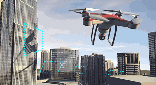
How would we represent a view in AR? In 3D modeling and game engines such as Unity, the view is a key component that gets set up through ‘cameras’ that are oriented in digital space. The field of vision is represented by a structure that looks like a sideways pyramid (the technical term is viewing frustum) projecting out from the camera location.
In the physical world, however, our devices are the actual cameras, with all the field of vision information already built in. What we need to track a view in space is an AR frame that we can easily align with our viewfinders. Here’s my hypothesis: by saving AR “frames” in space, we make it possible for users to discover and share good views.
Viewfinder: Helping photographers and location scouts save good shots
Photographers and locations scouts are always on the lookout for a good shot, so why not build something for them to save good views? There are two approaches to scouting for views today: onsite and remote. The onsite approach involves wandering around with your eyes wide open and a camera around your neck, hoping to find something shot-worthy. Or you could scout remotely by searching on sites such as Flickr and Instagram. These photos are geotagged, so you could save down a map of points where good photos have been taken. You then go on-site when you are ready to shoot, and consult your saved photos to find the views you are looking for.

What if we could make both processes even easier by saving the frames of exactly where the photos were taken in space? Applying the ‘frame’ approach above, I designed a Viewfinder, a conceptual app that lets serious photographers and location scouts save, track and discover good views. Let’s walk through two ways that Viewfinder could be used.
The first approach (UX flow below) caters to the onsite shot discovery behavior. Let’s say you’re a photography hobbyist, and you’re wandering around looking for a good shot. You pop open the Nearby tab of Viewfinder, where you see nearby photos that were taken. A blue ring around your location indicates the radius within which photos can be activated as augmented reality frames within your viewfinder. Tapping the shaded region, or the frame button at the bottom right, activates the viewfinder where you can see a group of popular views around you. The blue frames are views that can be captured from where you are standing; the lighter frames are further away but can be approached.

Tapping on each frame brings up more details on the views that have been captured through that frame. Having found a view you like, you orient your camera to the frame, and hit the red button to take the picture.
The second approach caters to the remote scouting behavior. Here, you are a location scout that doing some initial scouting remotely. You’ve heard that a particular location has good shots; you pull open Google Street View at that location to confirm. Spotting some interesting views, you click the view-saving plugin button to the right, drag a rectangle to frame the shot, and save it to a collection on Viewfinder.

After some more remote scouting, you’ve gathered a collection of views within Manhattan that you’ve called “Art Deco”. You now decide to visit the locations to confirm their suitability for your project. On arrival at one of your destinations, you open the Art Deco collection within Viewfinder. Blue circles indicate that two views that you had previously saved are in the vicinity. You tap on one of the blue circles, which enlarges into a button that lets you switch on the AR viewfinder for that particular view.
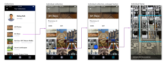
Switching on the AR viewfinder, you see only the frame for that particular view, along with your notes on that frame. You align your camera with the frame to inspect the view: it is exactly what you wanted. You’re happy with the Art Deco collection you’ve compiled, and share it with your colleagues.
That last action, sharing, highlights one area where these AR frames are very useful. Saving these frames empowers collaborators to asynchronously share good views. The location scout doesn’t have to be onsite to point things out to the director. A local doesn’t have to be there to call attention to where exactly people should be looking. Just save a collection of these views, share it, and the recipient can walk through these views in their own time.
The wonderful properties of the frame
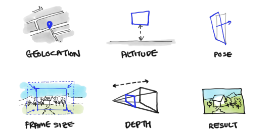
I want to dwell a little on the location-based frame. While straightforward in form, the frame is anything but simple. Here are six properties of a frame:
Geolocation — Long-lat location. This is needed along with…
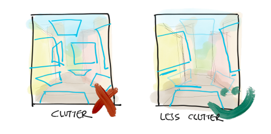
Altitude — … the altitude, to position the frame accurately in 3D space. Should the frame with its longitude, latitude, and altitude coordinates not fall within a sphere of a certain radius around the user, it should not be accessible by the user to avoid AR clutter.
Orientation/“pose” — In addition to the geolocation and the altitude, the frame requires information about its orientation to capture its true position. In Google Tango, they call this the pose. This is important since how you angle the device is going to result in a completely different view.
Size of frame — We move onto the characteristics of the view itself. The size is one such characteristic: is this a close up or a wide shot? The shape of the frame is also important, since you could take square photos, landscape photos, or even photos of any odd shape. For Viewfinder, I restrict it to rectangles to match how photos are traditionally framed.
Depth of camera (kept constant) — Since this is a mobile app, I assume that users are using cameras on their devices, which offer a constant depth of vision through a fixed aperture. The simple rectangular form of the frame works here: users merely have to align their viewfinders with the frame to ensure that they capture the view the frame is, uh, framing.
Resulting pictures — The frame is also associated with the pictures taken through it. This provides a reference for users to evaluate whether a frame is interesting without having to actually look through it, especially if the frame is some distance away. These pictures also capture the passage of time: different moments offer different views through the frame (e.g. nighttime versus winter).
These are properties of each frame. But what happens when you encounter many frames at once? Without adjustments, this would surely be an overwhelming experience. UX patterns are needed to reduce visual clutter, create hierarchy, and minimize confusion.
Only showing the frames that matter First, Viewfinder only surfaces frames within a certain radius from the user. The frames beyond that radius are of no importance: the user would not be able to capture those photos from such distance. Second, even within the vicinity, only popular frames are revealed. The user is shown the number of photos taken from the particular frame, and can tap into it to view the photos.
Vary opacity with distance For the frames in the vicinity, only the closest frames are the clearest, with more distant frames visible but faded. This indicates depth, and creates information hierarchy where the nearest frames are the most noticeable.
Indicate the right side of the frame A drawback of the planar rectangle form of the frame is that it is not easy to tell which side the user should be on. To make that obvious, the user encounters an opaque frame if they are on the wrong side. The user can also be shown an alert banner.

Combined, the above UX patterns alleviate the problem of visual clutter when there are multiple frames. Users now see at most 3 popular frames nearby within their viewfinder, with a few that can be discovered in the distance. They know when they are on the right side of the frames.
Beyond photography and location scouting
A common piece of feedback I’ve gotten about Viewfinder is that there may be more compelling use cases for this concept of frame-saving. Do photo enthusiasts and location scouts really need to overlay AR frames on their surroundings to find good views? Photographers pride themselves on seeking out views and moments when they are on location: they train their eyes to do so. They get improvisational. They seek out moments, which are hard to track with location-based frames. I am not a photography enthusiast myself, and I still have to test this idea out on location scouts, and so I do acknowledge this feedback.
One application I could see frames being more useful in is in travel. Unlike photographers and location scouts, travelers aren’t trained to look around and spot key views. Instead, they rely on guidebooks and people to point things out on location. There is some friction to using travel guides: you get to a particular location, and have to look around to find “that colonial building” or “the tiny statue” described in the guide. What if you could instantly scan your surroundings for points of interest? AR frames could be useful for that. A more particular form of travel that is relevant is nature travel. Saving views as AR frames could be useful for indicating good spots for birdwatching, or good views to catch certain natural phenomenons.
AR in public space
As mentioned at the beginning, Viewfinder is an exploration I’m doing as part of my thesis research on the discontents and opportunities of placing AR in public space. How does Viewfinder relate to this research?
When I started working on Viewfinder, I’d identified several imperfections of placing AR elements in public space. Many of these problems were made obvious by the widespread gameplay of Pokémon Go last summer. I’d found that interaction with public AR could lead to misinterpretation and misunderstanding, especially if user actions are similar to actions that mean something else, as shown by people attacking Pokémon Go players thinking the players were taking photos of them. AR elements could be placed in public locations that are undesirable either for the user or for surrounding people: threatening users’ personal safety, or encouraging trespassing, or even encouraging behavior deemed inappropriate at the particular location (e.g. gameplay in a place of worship.) AR experiences can also be a very individual, engrossing experience, not conducive to social interaction with others, nor to engagement with the surroundings.
With the above in mind, I set out to design Viewfinder in a way that would also mitigate these imperfections. Specifically, I wanted to take the follow principles into consideration:
1. Encourages user interaction with surrounding environment
Viewfinder draws the attention of users to interesting views around them, so that even after they put down their device, they can still appreciate the view in front of them. In fact, it could be argued that it increases appreciation of the surrounding environment.
2. Doesn’t clash w/ existing lexicon of gestures
Users of Viewfinder are searching for views to capture through their devices, which is in line with normal photography behavior.
3. Situated in locations that do not endanger users’ personal safety or encourage trespassing into private property
Since the AR frames in Viewfinder are generated from previously taken photos, these frames would be situated in locations that are most likely acceptable for users to linger in. These frames would also be less likely to put users in harm’s way e.g. be situated in the middle of a highway.
4. Situated in locations where user behavior isn’t deemed inappropriate
For similar reasons to the above, it is less likely that photo-taking will be problematic behavior where the frames are located.
5. Encourages social behavior where multiple users can interact with same element
With multiple users able to approach the same AR frames, and contribute to the database of frames by taking photos, Viewfinder encourages interaction between initial photographer and follower, or between multiple photographers on site interacting with the same frames.
Future applications of frame-saving
What I find most fascinating about saving frames in AR space is what can be built on this concept. When we begin tracking where every camera is pointed, where every view is captured, we start being able to measure what views people like to capture, and from where. By saving the views that people capture at scale, we could eye track the world. Knowing what people like to see in their environments could be interesting to the people who construct our environments — architects, urban designers, landscape designers. It would allow public advertising to track eyeballs and measure the ad performance in the same way digital advertising currently does.
And what if human users aren’t actually the target audience of these AR frames, but machines? Another area where views will be useful would be steering autonomous cameras rigged on drones or robots. Imagine a director of photography who composes a bunch of views for a particular scene, strings them together, and uploads them to a camera drone. The camera drone can then chart an autonomous path through these views, consistently capturing the same shot over and over again. Autonomous camera drones such as the Lily and the Hexo+ are already becoming popular: these drones are designed to track a single target subject right now (See 3DR’s description of how its SHIFT computer vision helps drones auto-frame shots), but could quickly be applied to filming other views if these frames can be saved.
0 notes